Excel Tip: Using conditional formatting to format the whole row

Coloured Rows in ExcelFrom the Not Just Numbers blog:

Colour-coding can make it much easier for humans to read a spreadsheet, as our eyes and brains are wired up to treat differences in colour as important. For example, you may colour rows as redamber or green based upon a status level – possibly, in a stock list, how close an item is to being out of stock.

If you do this, do you do it manually?

Many users know about Conditional Formatting, but do not know how to format whole rows in this way. I, for one, used it for years without knowing how to do this – but it’s really simple when you know how.

It involves using Conditional Formatting’s formula feature with Excel’s ability to fix references using the dollar sign.

Let us take a very simple example of stock, where we wish to show lines with less than five items as red, less than ten items as amber and ten items or over as green.

Assume we have a heading row so the stock data starts at row 2, and the stock level is the last column of the data and is held in column H.

Highlight cells B2 to H1000, or down to whatever row more than covers the number of stock items you might have. Select Conditional Formatting (from the Home ribbon on Excel 2007/2010, or from the Fomat menu on Excel 2003) and select “Use a formula to determine which cells to format” (in 2007/2010) or “Formula is” (in 2003).

2003 and 2007/10 work slightly different in this respect, as 2003 allows you to add up to 3 conditions using the Add button and 2007/10 allows many rules to be added and managed.

The following formulae should be entered as the three conditions in Excel 2003, or as 3 separate rules in 2007/2010. In each case you will determine the format to be used if this condition is true using the Format button next to where you enter the formula. This works very similar to the normal dialogue box you get when formatting cells.

For the red:

Formula         =$H2<5
Format          Fill Red

For the green:

Formula         =$H2>=10
Format          Fill Green

For the amber:

Formula         =AND($H2>=5,$H2<10)
Format          Fill Orange

(read more on the AND function here, under combining conditions)

The most important thing to note here is the use of the dollar sign. What we are doing here is fixing the column (H), but leaving the row flexible, so that all cells in the highlighted range, look along their own row to column H to apply the criteria. Also note that you should enter the formula as if you were entering it for the first row of the range – this is why we have entered H2 as row 2 is the top row that we have highlighted.

One other thing to note is that the formula is always preceded by an equals sign, even if it has an equals sign in the criteria. So, if we had wanted to format red when H2 was equal to 5, we would have, rather oddly, entered =$H2=5.

This technique has many applications, and is really simple when you get the hang of it.

If you enjoyed this post, go to the top left corner of the blog, where you can subscribe for regular updates and get your free report “The 5 Excel features that you NEED to know”.


Time saved using spreadsheets always beats time saved writing them!

Save time using ExcelFrom the Not Just Numbers blog:

I see many time-saving tips for Excel users that speed up the time it takes to prepare a spreadsheet, such as keyboard shortcuts, text-to-columns, etc.

Where these are all very useful, I sometimes feel that an important truth is often overlooked.

A spreadsheet gets built once, but is used hundreds of times!


It is always worth having this at the back of your mind (or stuck on the wall above your desk!) when you are building a spreadsheet.

Anything that can be done when setting up the spreadsheet to speed up the experiencefor the user (even if that’s you) will pay for itself many times over.

This understanding can often be the difference between an amateur spreadsheet and a professionally produced one. They both do the job, but the good spreadsheet will let you do it in half the time, saving far more than the cost of doing it properly in the first place.

There are many ways in which a good spreadsheet does save the user time, such asdrop-down listslogical data layout and conditional formatting, but the key is to know it’s important. If the user is having to copy and paste, change formatting or type something more than once, these are good indicators that the spreadsheet could have been better designed.

If this is the case, it is costing you every month, week or day (depending how often the spreadsheet is used) and it needn’t be the case. Take another look at it and see where it can be improved – or get it rewritten by a professional. Either way, you will be amazed at the time savings that are possible.

If you enjoyed this post, go to the top left corner of the blog, where you can subscribe for regular updates and get your free report “The 5 Excel features that you NEED to know”.


Do you deny how much your team uses Excel?

Denying Excel UseFrom the Not Just Numbers blog:

“A prudent question is one-half of wisdom.”

In too many years of experience helping organisations to make better use of Excel, one truth has become evident:

The higher you move up an organisation, the less they think the organisation uses Excel.

I am currently talking to many accountancy practices and this seems even more true in that industry.

Causes of Excel Blindness
There are a number of reasons why this should be true but it can be incredibly damaging for reasons I will go into later in this post.

I believe that the main causes are as follows:

  1. The day-to-day experience of those involved – The higher you go in any organisation, the more your role involves relationships and meetings, rather than hands on number-crunching. Naturally those producing the numbers and analysing them use Excel far more than those discussing them;
  2. Belief in computer systems – Having invested in accounting and/or ERP packages (or in the case of accountancy practices, accounts preparation software), and been sold the omnipotent nature of these packages by the software companies, it can be difficult to believe (or face) that there are still large amounts of work done on spreadsheets.
  3. Over-simplification of what processes involve – A manager, for example, may understand that a member of the team is emailed a particular piece of information from a customer,a supplier, another branch or another department, and that they enter this into the system. The member of the team involved will know that they receive this information as an Excel file and they apply numerous sorts and filters, delete columns and rows, calculate totals, etc. before they enter it (or even import it) into the system. All of this work is done in Excel – and the manager is completely unaware.
Why does it matter?

It matters because it can be incredibly damaging to an organisation in terms of both financial risk and inefficiency:

Financial Risk

Not understanding the systems that your business relies upon can lead to errors in systems management don’t even realise are being used. The controls in the ERP system or accounting software may be perfectly adequate, but if the information entered is coming from a spreadsheet with an inbuilt error, they won’t be of much use.

Inefficiency

In most organisations, this is by far the greater cost. Many staff are using Excel for a great deal of their time and have very little training or understanding of how best to use it. Many hours can be cut from most employees’ working weeks, with a little bit of focus on this area.

Let is use the situation described earlier to demonstrate both the efficiency and financial risk elements:

“The member of the team involved will know that they receive this information as an Excel file and they apply numerous sorts and filters, delete columns and rows, calculate totals, etc. before they enter it (or even import it) into the system.”

This whole process could be automated in Excel so that a couple of hours of messing about, could be reduced to a couple of clicks. This not only saves those couple of hours every month, week, or even day, but ensures that the same conversion is applied to this spreadsheet each time, significantly reducing the risk of error.

What can be done?

The first step is to acknowledge how much your organisation uses Excel. No matter how sophisticated your systems are, there are many jobs around the edges of the system for which Excel is not only the best tool, it is often the only tool capable of the flexibility required. Acknowledging this can lead to some very quick improvements to efficiency.

Ensure that you have access to someone (either inside the organisation or from outside) who can look at this Excel use and suggest and/or implement improvements and train staff. I offer this type of service to UK accountancy practices via my Excellent Accountancy business, but please feel free to email me if you wish to discuss how to go about it for any other type of organisation.

Excel is not just Word for numbers, it does form parts of your key processes – whether you like it or not.

Imagine if you took the same lax approach to any other key processes in your business.

A little time and/or money invested in improving how you use Excel will go a long way, as it is such an untapped area in most businesses.


Use Excel to generate invoices and report on sales

From the Not Just Numbers blog:

I come across many small businesses who use Excel (or Word) to produce an invoice template that they can email or print and post to their customers.

Usually the sale detail is entered on the face of the template and this is saved as a separate file for each invoice. The problem here is that to be able to report on this information for accounting purposes, or sales analysis, the information needs to be recorded somewhere else in one file (either another spreadsheet, or an accounting software package).

What is really needed is to be able to enter the sale details once and for this to be used to populate both the invoice template and the sales reports.

If an accounting package is being used, the best answer would usually be to use an invoicing module in the accounting software and ditch the external template, however if this is not an option, or an accounting system isn’t used, then we need the invoice template and the sales history to be linked.

Here is my approach to this problem, in the simple scenario where each invoice has one line of detail. If more lines are required a variation of this approach can be used, but this is a little too complicated to go into in this blog post.

General Approach
This approach involves three main worksheets within the one spreadsheet, Customer Data, Sales Data (what accountants often call a Sales Day Book) and the Invoice Template.

Customer Data
This worksheet, as the name suggests, is where all of the customer data is held. The sheet should follow the rules for laying out data that I outlined in an earlier post (How to lay out data in Excel). It should have column headings for name, address 1, address 2, etc. and one row for each customer, new customers are just added to the bottom of the list as needed.

The first column should be a unique identifier for that customer, it may be possible to use the name for this but you would need to add a new customer on a change of name rather than editing the existing one. Often better is to use the approach used by most accounting systems and allocate each customer a unique Account Code. I often use Conditional Formatting on this column to identify any duplicates.

The spreadsheet will use this sheet to provide the customer address details for the invoice.

Sales Data (or Sales Day Book)
This sheet should again follow the rules mentioned above. Here the business will record all sales, one line per sale. Headings should include (at least) Invoice No (in the first column), Date, Amount, Customer Account Code (the unique identifier mentioned in Customer Data above) and Description. Depending on needs the amount may be a calculated column, multiplying entries in columns for price and quantity. The business may also need a column for VAT or any other sales tax. The Customer Account Code column should use Data Validation to restrict entries to those codes in the first column of the Customer Data sheet.

The VLOOKUP function can then be used to pull in the customer name and address details in columns to the right of the entered data, using the customer account code to look that information up from the Customer sheet.


Invoice Template
If the business is already using an Excel template then this can be used as the basis of this sheet, otherwise some work will need to be done to produce a satisfactory layout for the invoice.

Ultimately there should only be one editable cell on these sheet – the Invoice Number which should be a dropdown based on the Invoice Number column of the Sales Data sheet.

VLOOKUP is then used on the rest of the invoice to pull the Customer Name and Address, Date, Description, Amount, etc. into the appropriate cells from the Sales Data sheet, based upon the Invoice Number selected.

I would recommend that to email the invoice to a customer, that it is printed to pdf first. This not only gets round the problem that all of your other sales data is in the same spreadsheet, but looks far more professional than sending a spreadsheet to the customer.

Reporting
As the sales data is all correctly laid out and, depending on the size of the business, at least a year’s worth of sales can be stored in the one spreadsheet (usually many more) then Pivot Tables can be used to report on these sales in any way that is required.

Just don’t forget to make sure you take regular backups and there is no need to record your sales anywhere else.

Adding categories to data in Excel – how to save you time later

From the Not Just Numbers blog:

In my previous post, I stated that one of the major problems with how most Excel users lay out their data, is using a column for each category.

In the feedback I have had from that post, it was felt that this point needed further explanation and/or an example, so I thought I would provide both here.

First of all, here is the point as it appeared in the original post (it was point number 3):

Don’t group data by putting it in different columns (THIS IS THE ONE THAT ALMOST EVERYONE GETS WRONG)

    • Don’t split out financial or numerical data into separate columns to categorise the data into months, expense categories, customers, agents, etc.
    • Do have one column for the financial or numerical data and create a column for month, expense category, customer or agent, to categorise each row;
    • You can use data validation drop-down lists to select the appropriate category for each row;
    • This one is counter-intuitive because in any report, you will almost certainly will want a column (or row) for each of these categories – but if you do this in the data you will massively restrict what you can do with it.
Let’s look at some sales data laid out the wrong way:
I have left out any extra data (other than the date) to keep it simple. With the data laid out like this, you could use the SUM function to calculate monthly totals, but you can’t do a lot more than that. If you were to use the data in a pivot table, you would have to add the data as 12 data fields, making it very cumbersome and inflexible.
Also, if you wanted to do any calculations on this data, such as calculating VAT, or any other Sales Tax for that matter, you would need another 12 calculated columns!
You then get into further problems if you want to analyse the data from another perspective – by salesperson for example.
A better approach

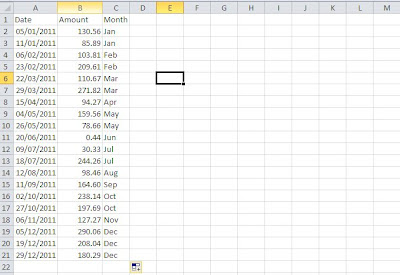
Now let’s see a better way to lay this data out:
You can also automate the month column using the following formula in cell C2:
=CHOOSE(MONTH($A2),”Jan”,”Feb”,”Mar”,”Apr”,”May”,”Jun”,”Jul”,”Aug”,”Sep”,”Oct”,”Nov”,”Dec”)
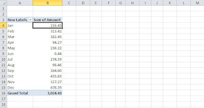
Laid out like this you can use the month as a way of analysing the amount in a pivot table for example:
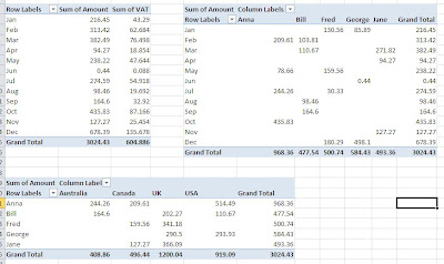
Its real power however comes when you wish to add additional analysis and calculations, so for example you could add additional analysis columns for Salesperson and Country, and a VAT column (being 20% of amount):
You can then produce all manner of pivot tables, here are just a few examples:


It would be just as easy to show the months as columns – the only reason I haven’t is to make best use of the space.
And remember, you can at any stage easily add further analysis or calculation columns as your reporting needs change.
I hope this has explained this point in more detail and even more importantly, highlighted the value of getting it right!


99% of Excel users get this wrong – How do you lay out your data?

From the Not Just Numbers blog:

“Learn the fundamentals of the game and stick to them. Band-Aid remedies never last.”

Jack Nicklaus (Champion US golfer)


When someone comes to me with a problem in an existing spreadsheet, the problem is invariably in the layout of the data. The spreadsheet is built for one purpose and works OK for that until something slightly different is required and it proves almost impossible to get the report that’s needed.

If a few simple rules are followed when laying out your data, then producing additional reports from that data, and using it for different purposes, becomes simple, instead of the nightmare it is for many users.

These rules apply to any lists of data, be it monthly financial information, transactional data (such as lists of sales, purchases, payments or receipts), customer or supplier lists. If you are going to store data in your spreadsheet to produce reports from, you need to follow these rules.

At the heart of these rules is the approach – you are not laying out your final report here, you are laying out the data in a format that can be reported from! These are two very different things (see my OAP approach to reporting in Excel).

The rules to follow:

  1. Columns with headings and no gaps
    • Every column should have its own UNIQUE heading, in the first row;
    • There should be no empty columns;
    • These columns represent the fields of a database, e.g. Customer Code, Customer Name, Telephone Number, Email Address, etc.
  2. One row per record and no gaps
    • Every record should have all of its data on one row. E.g. in the above example, one row per customer;
    • There should be no empty rows;
  3. Don’t group data by putting it in different columns (THIS IS THE ONE THAT ALMOST EVERYONE GETS WRONG)
    • Don’t split out financial or numerical data into separate columns to categorise the data into months, expense categories, customers, agents, etc.
    • Do have one column for the financial or numerical data and create a column for month, expense category, customer or agent, to categorise each row;
    • You can use data validation drop-down lists to select the appropriate category for each row;
    • This one is counter-intuitive because in any report, you will almost certainly will want a column (or row) for each of these categories – but if you do this in the data you will massively restrict what you can do with it.
The benefits:
  • Data following the rules above is perfectly prepared to be analysed using countless tools within Excel, for example: pivot tables, autofilter, SUMIF, COUNTIF, etc.
  • Most changes to the data don’t require a change to the data layout. New categories, e.g. expense categories, customers, agents, etc. can just be added to the drop-down lists. Any new entries in these columns will be automatically picked up by pivot-tables, autofilter, etc. with no work involved.If you had to create a new column each time, you would also need to edit every report that used the data.
  • You can choose to analyse the data by any category you want. It takes seconds to edit a pivot table that has a column for each month and change it to a column for each expense category. This is almost impossible if the data was laid out in those columns.
  • You can add additional category columns to the data if needed and these can even be calculated from the data. You might, for example, introduce departments – simply add a department column to the raw data, and your pivot tables can analyse the data by this category as well, or instead of existing categories.
As you can see, if you lay out your data according to these rules, you can do pretty much anything you want with it. The spreadsheet can grow with your business, and with any additional reporting requirements you want to add.
It can take a little bit of time to get your head around point 3, but believe me, you’ll be pleased you decided to be among the 1% that get this right.
If you’d prefer me to redesign your spreadsheet for you, just visit www.needaspreadsheet.com and let me know what you need and I will send you a fixed price quote.


Is fiddling with Excel a good or a bad use of time?

From the Not Just Numbers blog:

I’d really like to know what everyone thinks about this question – because I am not sure myself.

I have always fiddled with Excel until I got it to do what I wanted. For me, personally, it has worked out very well as I turned the skills I developed as a result into a successful business! But was it good for my employers at the time?

Granted, they got some good spreadsheet solutions in the end, but would it have been more effective to bring someone in who already knew how to do it, rather than use my time to get there by trial and error!

I’m sure I’m not alone as someone who likes to make sure they find a way, but it can be all too easy to spend far more time than could be justified in financial terms. Once the problem has been solved, the skills are there for next time, but is it the most efficient approach?

There are a few alternatives to fiddling with it until you get there using Google and Excel’s help facility, they all have a financial cost but can considerably reduce the time spent:

  1. Excel training – this can obviously be useful but is often too generic to then apply to your real problems when you get back to the office. I have found a one-to-one approach is often more effective, working with the client’s own spreadsheets and problems. Another approach is to have training tailored to your business or industry (the service I offer to Accountants in Practice at Excellent Accountancy works along these lines)
  2. Subscribe to a service where you have someone to ask – my Excel Advice by Email subscribers get this kind of service by email for just £75 per year
  3. Get someone else to do it – I have my own service for this at needaspreadsheet.com
My suspicion is that any one of these could be right, depending on the relative value of your time vs your business cash, and whether you ultimately want the skills in-house.
If you have plenty of time and no cash (especially if you want to develop the skills yourself), then keeping fiddling is probably the best route (it worked for me!). At the other end of the scale, your time is usually more valuable than the cost of getting the job done outside, and this for many is a no-brainer if the primary purpose is not to build your own Excel skillset.
I’d love to hear what you do now, and what you think is best as they may not be the same!


If you enjoyed this post, go to the top left corner of the blog, where you can subscribe for regular updates and your free report. If you wish to help me to provide future posts like this, please consider donating using the button in the right hand column.


It ain’t what you do, it’s the way that you do it!

From the Not Just Numbers blog:

One of the most common misconceptions I come across when helping others to get the most out of Excel is the belief that it is all about learning new functions and capabilities. This misconception is compounded as most Excel training will teach you new functions and capabilities! My Pivot Table Training videos are no exception to this!

Where learning new functions is most certainly useful, it is rarely what holds people back. We can generally learn new functions from a quick Google search or just by using the fx button.

What really transforms what you can achieve using Excel is your approach. If you get the thinking right, you can always find the functions you need to achieve what you want.

My OAP Approach to Excel

One useful method I adopt to help clients change their approach is to teach my ‘OAP method’.

This helps to separate the different tasks a spreadsheet needs to do, so that it does them all well. Trying to address all of these steps together is where most people come a cropper!

O is for Obtain

The O in my OAP approach is for Obtaining Data. This is key to getting your spreadsheet right and will make everything else easier.

Whether the data to be used is to be entered directly into the spreadsheet, or imported from another database or system, there are two factors to take into account:

  • Does the layout make it easy to input the information?
  • Is it laid out in a way that makes the other steps easier?

What should be completely ignored at this stage, is the layout of the final output! This is important, and is the most common reason people get bogged down with cumbersome and inflexible spreadsheets.

Any data to be entered should be in one place, using tools such as drop-down lists to make input as easy as possible.

Where there are multiple transactions or records, these should be held in a list with one row per transaction or record, with column headings and no blank column headings. Formatting is very much secondary here.

For example, a list of invoices should have columns for Date, Invoice Number, Amount, etc.

Where multiple lists of transactions or records are to be used, these should ideally have their own sheets, with no other information on them.

A is for Analyse

For my readers abroad, that is how we spell it in the UK!

This is where the calculations are done.

If the data has been collected in the right format (see O for Obtain above), we can add any calculations to the lists by adding extra columns alongside. Because the format is right, these calculations can just be copied down so that they are applied to every row.

This is also true for looking up additional data from the other lists in the spreadsheet. For example, we can use the VLOOKUP function to add address columns to an invoice list, by pulling the information from a customer list held on a separate sheet.

The objective in this step is to ensure that on one sheet we have columns for all of the items we will need in the final output. These will either have been populated via data entry (or import), or have been calculated or looked up.

P is for Present

Finally we start to address the final presentation, but this is now a lot easier as the all of the data we need is now accessible in a format that makes it easy to report on and use.

We can now use Pivot Tables to present the information in many different ways or functions such as  VLOOKUP and SUMIF or COUNTIF to pull the data into specific cells if a pivot table does not do the job.

We can also use a combination of pivot tables and the GETPIVOTDATA function to give us the most flexibility.

If you work in a UK accountancy practice, I offer a service specifically for you that will really help you change how you use Excel at Excellent Accountancy.

For everyone else, please let me know if I can help with anything, or alternatively why not get me to do it for you at needaspreadsheet.com.

If you enjoyed this post, go to the top left corner of the blog, where you can subscribe for regular updates and your free report. If you wish to help me to provide future posts like this, please consider donating using the button in the right hand column.


EXCEL TIP: Eliminating #DIV/0! and other errors automatically using ISERROR

Error

From the Not Just Numbers blog:

Excel is great for being able to apply the same calculation consistently by simply copying the formula to all of the relevant cells, however often there are times where some of the data isn’t how we would like it and the formula throws up an error.

The most common of these is the #DIV/0! error that Excel returns when trying to divide a number by zero. As Excel struggles with the concept of infinity it returns this error. A common situation where this occurs is in a Gross Margin Percentage calculation. We may have multiple products with sales and profit figures and a formula to calculate the margin as a percentage, i.e. profit/sales formatted as a percentage.

This will work fine until you come to a product with no sales where the formula will return #DIV/0!.

This can be addressed using a combination of the IF statement and ISERROR (note that in Excel 2007 and 2010 there is a combined function called IFERROR, however the solution proposed here will also work in earlier versions of Excel). If you need a refresher on how the IF statement works take a look at :

If cell A1 contains the Sales figure and B1, the Profit, then to show the Margin Percentage in C1, we would format it as a percentage and use the following formula:

=B1/A1

This will return the #DIV/0! if cell A1 is empty or zero.

The ISERROR function returns TRUE if its argument returns an error and FALSE if not, therefore

=ISERROR(B1/A1)

will return TRUE when this #DIV/0! would occur.

We also need to decide what we want to appear instead of the error. In this scenario, I usually show 0% which is what I have assumed for the example.

Using the ISERROR formula above as the condition for the IF statement, we can return zero if it is an error, or the original calculation otherwise. So C1 becomes:

=IF(ISERROR(B1/A1),0,B1/A1)

No more #DIV/0! errors!

A similar approach can be used for any other common errors, such as when a looked up value is not in the list.

If you enjoyed this post, go to the top left corner of the blog, where you can subscribe for regular updates and your free report. If you wish to help me to provide future posts like this, please consider donating using the button in the right hand column.

EXCEL TIP: Using the SUMIF function to interrogate lists

Woman Doing Calculations

From the Not Just Numbers blog:

How many times do we need to pull out a particular category of numbers from a list and add them up. Well, you might not be aware that Excel has a pretty simple function designed to do just that.

The SUMIF function can be used to pull out departmental information from a trial balance, sales information from a transaction list for a particular salesman, department or division (as in the example we will use), or for any other situation where you have a list and need to selectively sum a subset of that list based on criteria.

It is actually a pretty simple function when you know how it works, but is very powerful in the types of situations outlined above.

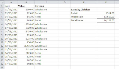
See below the example situation we will be using to illustrate this function:


This is a simplified situation where we have a list of sales transactions in columns A to C (maybe imported from your accounting software) and want to report total Retail and total Wholesale sales.

We will use SUMIF to return the values in cells F3 and F4.

The format of the SUMIF function is as follows:

=SUMIF(CriteriaRange,Criteria,SumRange)

where CriteriaRange and SumRange are one column wide and the same number of rows as each other in height.

CriteriaRange is used for the column that includes that data that you wish to filter your sum by (in our example, C2:17).
Criteria identifies which item in the criteria range column you want to sum (in our example, “Retail” or “Wholsale” for cells F3 and F4 respectively).
SumRange is used for the column that holds the data you actually want to add up (in our example, B2:B17). This argument is optional and if not entered CriteriaRange is used.

So for our example, cell F3 contains:

=SUMIF($C$2:$C$17,E3,$B$2:$B$17)

Notice I have used the dollar signs to fix the ranges and used the reference to cell E3 rather than the word “Retail”. This can then be copied down to cell F4 to become:

=SUMIF($C$2:$C$17,E4,$B$2:$B$17)


The criteria does not need to be a simple matching as in our example. A condition such as “>0” could be used to sum only positive values (this is an example where you might not enter the separate SumRange as the criteria is applied to the data being summed.

With our example data, the formula:

=SUMIF($B$2:$B$17,”>1000″)

returns £1,431.

Have a play with it and see what you can use it for.

SUMIF is great if you know the exact format of the output that you want and you require a fixed layout. If you want to summarise all of the data in your list dynamically, a pivot table might be more what you need.

If you want this kind of help on hand when you need it, have a look at my Excel Advice by Email service which provides email advice when you get stuck for a small subscription.


If you enjoyed this post, go to the top left corner of the blog, where you can subscribe for regular updates and your free report. If you wish to help me to provide future posts like this, please consider donating using the button in the right hand column.